
Take the right color pill with this post about the Matrix control in the RTC Report and how it can help you. But, this topic is not for the novice, so make sure you buckle up.
In this post, we’ll talk about how to bring together diverse data into a dynamic table – we’ll use some Item Sales data for customers by month, which has always been a pest to accomplish in the Classic Report Sections. We’ll be going over:
- How to setup the raw data for the RTC
- Creating the basic Matrix
- The basic idea of Row and Column Grouping
- Controlling Visibility
- Introduction to Totals
- Cleaning Up
This one topic will probably spawn a host of follow-up posts to explain parts, or expand on other possibilities. I even considered having this post broken out into the 5 parts above because it’s a lot of ground to cover.
How to setup the raw data in Classic
Firstly, we’ll need to bring together all the data requested:
- Customer Info
- Item Info
- Sales Invoice Info
- Month info (yes, this is key)
Note: You may want to review our RTC vs Classic data structure post here.
We’ll start out with a data structure like so:
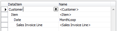
- Setup your filter request fields on them as appropriate.
- None have a DataItemLink linkage to each other.
- On the Date DataItem, we’ll set the DataItemTableView to limit the results to Months and ask the user for a Period Start filter.
- On the Sales Invoice Line, we’ll set the DataItemTableView to limit the results to Type=ITEM. On the Sales Invoice Line, we’ll want to manually handle our filtering in OnPreDataItem, like so:
SETRANGE("No.",Item."No.");
SETRANGE("Sell-to Customer No.",Customer."No.");
SETRANGE("Posting Date",MonthLoop."Period Start",MonthLoop."Period End");
Note: This assumes all data is version 2009+ data. The Sales Invoice Line table got the Posting Date field in version 2009, so if your customer has older data, you’ll either want to populate the Sales Invoice Line Posting Date field with the header data or you’ll have to have a Sales Invoice Header item.
You’ll then want to setup the Sections to display these elements, like so:
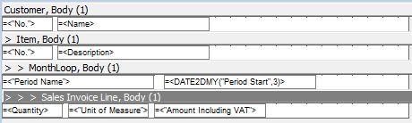
Make sure to set easy to follow DataSetFieldName properties on each. Notice how MonthLoop has both the “Period Name” (aka Month Name in our case) and the “DATE2DMY(“Period Start”,3)” function (Year integer). If your customer wants to run the report over the course of multiple years, you’ll need that Year value to differentiate one January from another.
Once you have all the data you’ll want, make sure to save the report, then Create Layout Suggestion.
Note: Consider adding the standard Page Headers here so Suggest Layout takes care of them for you. Our example plans to go to Excel, so no headers/footers are required.
Create the Basic Matrix
Once you see your suggested layout, you’ll wonder why we had you do that. Not sure why, but something happens in that sequence that links the DataSet to things behind the scenes. Without that step, we have not been able to get a Matrix to work correctly.
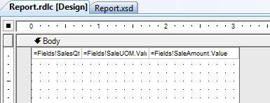
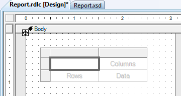
Go ahead and delete the unhelpful table:
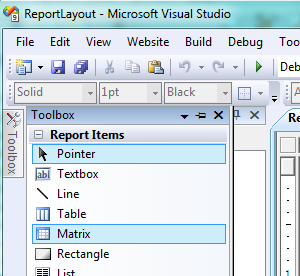
Now, let’s create a Matrix in the space we have. On the Toolbox item to the far left, pick a matrix and drag it onto the Body:
You should get an empty matrix:
Not much to look at, so let’s add some content.
The Basic Idea of Row and Column Grouping
So, let’s review what we need to accomplish: We need Item Sales Quantity and Sales Amount by Customer and Item by Month and by Year. Hopefully you see how that equates out to 2 row groups (Customers and Items) and 2 column groups (Year and Month), with somehow 2 columns of data inside each.
With both the Row and Column Groups, we always get one of each to start with, so we’ll focus on adding/setting the Row Groups first.
Customer and Item Rows
Right-click on the Rows box and select Insert Group. You’ll be asked to set the properties of the new group:
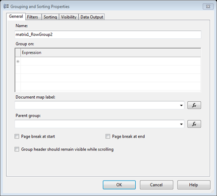
Go ahead and change the name part RowGroup2 to ItemGroup for clarity. In the Group On, Expression area, click in the first row. You’ll be able to select from the Fields:
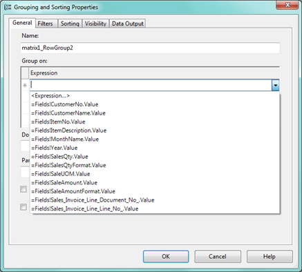
Select your Item Number field from the list (your field names may vary based on how you set the DataSetFieldNames).
Note: If you don’t see these fields, close up the Designer, close NAV, reopen NAV, reopen the report, delete the Layout, and redo Create Layout Suggestion.
That’s all we’ll set on this for now, though we’ll be back. Click OK. You should still see the ‘Rows’ field as blank, but a new column added:
Adding the Customer Group:
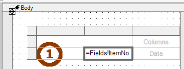
- Right-click the field that is marked (1) in the picture above and select Edit Group.
- Change RowGroup1 to CustomerGroup for clarity.
- Set the Group On Expression to Customer No.
- Click OK.
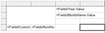
- You’ll see the exact same thing as above. In this case, we’ll need to also set the Value property manually to the correct field:

Adding the Year and Month Columns
A very similar process is used here. We’ll Insert a Column Group for Month, then set the existing Column Group to Year. No pictures, just quickly stepping through:
- Right click on the Columns block and select Insert Group.
- Setup ColumnGroup2 as MonthGroup based on the Month Name as the Group On Expression
- Right click on the Columns block again and Edit Group.
- Setup ColumnGroup1 as YearGroup based on the Year Integer as the Group On Expression
- Set the Value property of the Year Group to the Year Integer
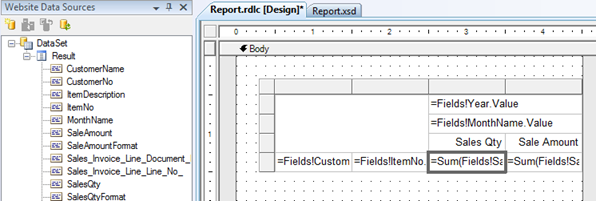
Adding the Quantity and Amount Data Fields
On the Data field, right click and select Add Column. That will split the single cell into four, like so:
Note: It’s critical that those blank cells are below the Column Group headers. If not, delete the Matrix and start over.
Now you can drag and drop the Fields from the Result list on the left to populate the bottom two empty fields (it’ll auto-caption):
Note: This approach does not bring over the Multi-Language Captions from NAV to try to keep this overview short. Bear in mind your customer needs for multi-language support before you implement exactly as outlined.
Note: This walkthrough also does not address properly formatting fields using the Format DataSet items, so make sure to bear that in mind as well.
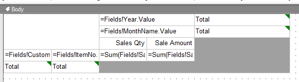
You can go ahead and save it as is, and give it a run to see how it looks, it technically works now:
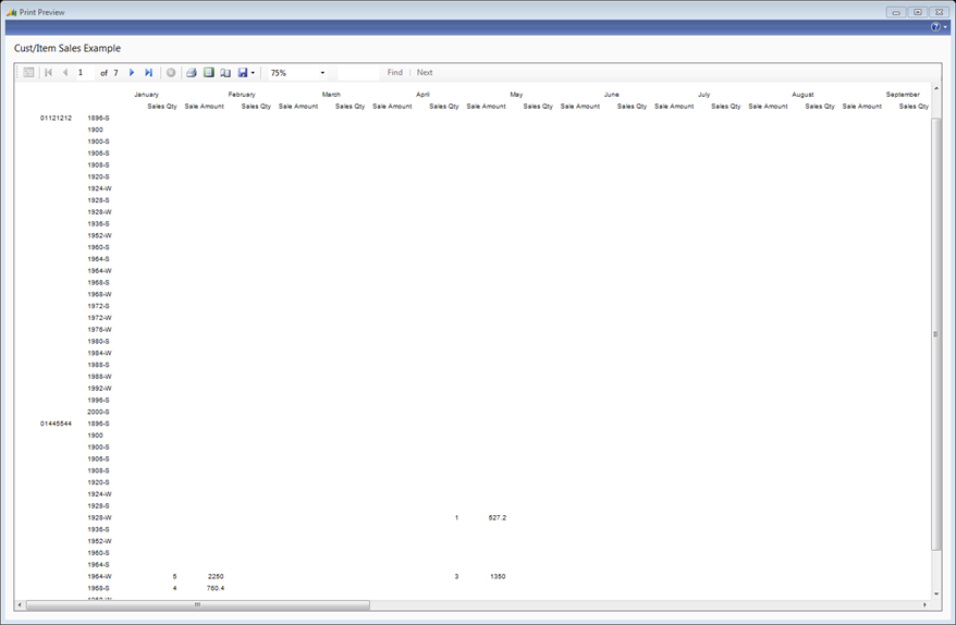
You can see it automatically took care of grouping our Customers and Items by Month and Year, with some data.
Controlling Visibility
Obviously, Items that weren’t sold to a given customer are adding a lot of blank space we don’t need. Thankfully, we don’t have to write any C/AL to SKIP records, we can control the Visibility of Group Rows.
- Open the report up in the Designer
- Right click on the Item No field we setup before and Edit Group
- Let’s look over the Visibility tab:
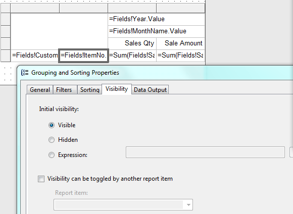
Change the Initial Visibility to Expression. In my case, the expression will simply be:
=Sum(Fields!SaleAmount.Value) = 0
This may be a trifle confusing. While it’s talking about if it should be visible, it’s setting the Hidden property. In my case, if the Group’s SUM of SaleAmount is zero, then Hidden is TRUE.
The same Visibility property can be set for any Row or Column Group. I’ll set it to my Customer Group as well, but not my Month/Year columns, as the customer wants them to show regardless.
Introduction to Totals
The customer wants there to be subtotals per Customer, a grand total per month, subtotals per year per item, and pretty much everything that can be totaled. Not a problem.
For each Row or Column Group that requires Totals, simply right-click on the relevant group field and select Subtotal:
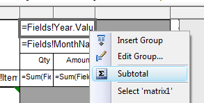
In our case, we’ll turn them on for everything:
Those grey spaces will be automatically populated by the totals. Let’s break down what totals are which:
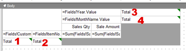
- This will be at the very bottom, a grand total, with totals per month/year across ALL Customers and ALL Items
- This will be at the bottom of each Customer, with subtotals per month/year across ALL Items
- This will be at the far right, a grand total, with totals per Customer and per Item for ALL months and years run
- This will be at the right of each Year, with subtotals per Customer and per Item for ALL months for that year
Any or all of those can be powerful data elements to be able to include with two clicks each. You will want to update the Captions for each, likely, so users understand the data they’re totaling.
Cleaning Up
There are many things we can do from here to tidy up. I’ll list several of them, and then review a couple of them:
- If this were going to be printed, add header/footer data
- Resize the columns to better fit the data
- Align the Column Headers to make more sense
- Add the Customer Name and Item descriptions to the Rows
- Apply Border Grids to the whole matrix
- Apply special formatting to Total Rows/Columns/Fields to better differentiate
Add Name/Descriptions to Number Fields
This one is super easy, but not intuitive if you’re used to C/AL.
Select the Customer No. textbox, then under the Properties panel, select the Value drop-down and double-click Expression:
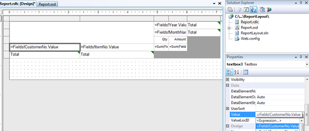
You can easily use this screen to select additional fields. After the existing expression text, add:
+ ": " +
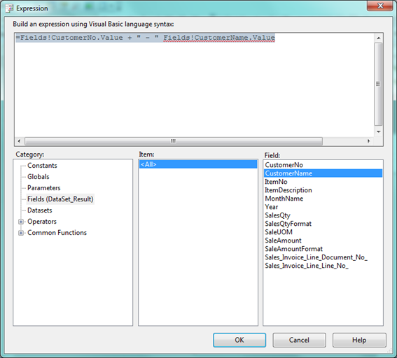
Double-clicking on your Customer name under Fields will insert the right coding for it.
Note: As you become more comfortable with the Designer, you do not need to open the Expression builder to enter these things, you can just type them right into Value.
Add Borders to the Matrix
- Click on the large empty cell in the Upper Left.
- Hold down Ctrl on your keyboard and select all the other fields. You can’t select the grey space, it will assume you mean the whole matrix control.
- Change the property BorderStyle from None to Solid.
Add Special Formatting to Total Data
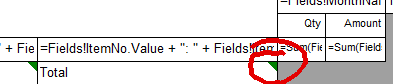
If you have already charged ahead and set the Total fields to Bold, you’ll have noticed that the labels were made bold, but the data was not.
You have to click on the little green arrow in the corner of the Total field to set formatting special on the auto-generated cells:
When you have done that selection correctly, you will see the Properties panel set to the Subtotal control instead of a textbox:
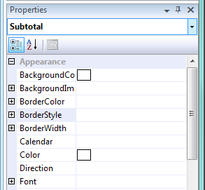
You can setup separate Borders and Font settings for the generate total cells. For example, you may want a BorderStyle Top set to Solid, a BorderWidth Top set to 2pt, and FontWeight set to Bold. This will great a strong visual cue that it’s a total row.
Download the text object here.
In closing, there’s always more you could do with a report like this, but hopefully we’ve whet your appetite for Matrix reports.